The latest from the Index shows that economic misery is still increasing, mostly due to unemployment and UNDERemployment (people being forced by job scarcity to work fewer hours than they need to or at a lower salary level than they are qualified for). However, the stock market is steadily climbing its way up, leading most media sources to report a slow-but-sure end to the recession. What these numbers suggest, however, is the end of the recession for some in certain sectors while others stay miserable, poor, and jobless. HuffPo calls this effect a "two-tier economy" which is decidedly NOT a good thing.
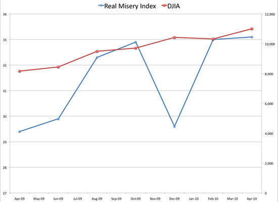
This handy graphic illustrates the situation. The red line is the Dow Jones Industrial Average, climbing, climbing up. A good thing, if you're an investor or a CEO. The blue line is the Real Misery Index, also climbing, climbing (except last December, when we got a bit of a break). A bad thing, if you're most of America. (The Real Misery Index is better, ie less miserable, when lower.)

As the NC legislature comes back into session, I can only hope that they (and lawmakers around the country) do not abandon job-creation and stabilization efforts just because some measures of economic well-being are up. A job seeker myself, I can speak to the lack of well-paying jobs in the metro area of the Triangle. I can only imagine what rural NC is like for un- and underemployed folks right now. We've got to keep the pressure on for reform and support for everyone, not just the top tier.

word.
ReplyDeletenice misery graph. i almost spelled it graff, but i'm no dumby.